@pmbaumgartner/pi-table0.1.1
Composable TypeScript table and row-picker library for Pi extension UIs.
Untested on omp
This is a pi package. No one has reported whether it works on omp yet. If you try it, add your result below.
Reports 0
No reports yet.
Readme
Pi Table
Composable TypeScript tables and single-row pickers for Pi extension UIs.
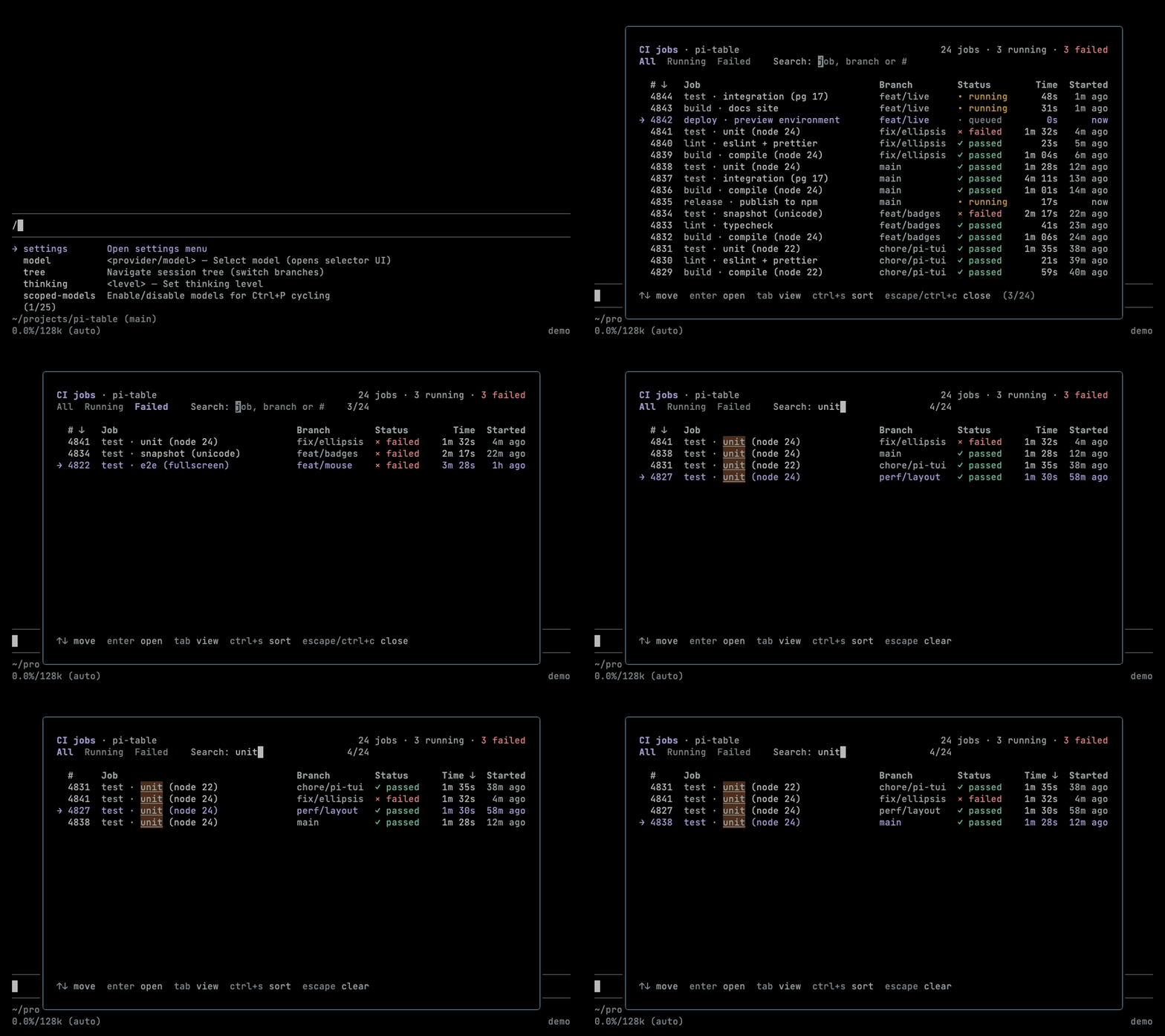
Tableis a responsive, content-sized table for widgets, screens and tool results.SelectTableis a single-row picker built onTable, driven by Pi's keybindings and mouse.sortRowsandmatchSpansare pure helpers for sorting and search highlighting.
Install
npm install @pmbaumgartner/pi-table
npm install --save-dev @earendil-works/pi-coding-agent@1.5.0
This is a library for extension authors, not a Pi extension: use npm install,
not pi install. Importing it registers no commands and starts no background work.
Examples
Each bundled example is a complete extension. From a checkout, run npm ci and
npm run build first. From a project that installed the package, use npx pi and
the copies under node_modules/@pmbaumgartner/pi-table/examples/.
| File | Try it | Shows |
|---|---|---|
examples/widget.ts |
/table-demo; /table-demo clear removes it |
Live pipeline widget with progress bars |
examples/custom-screen.ts |
/table-screen |
Framed jobs browser: search, views, sorting and mouse |
examples/tool-result.ts |
Load with Pi's todo.ts, then ask Pi to list todos |
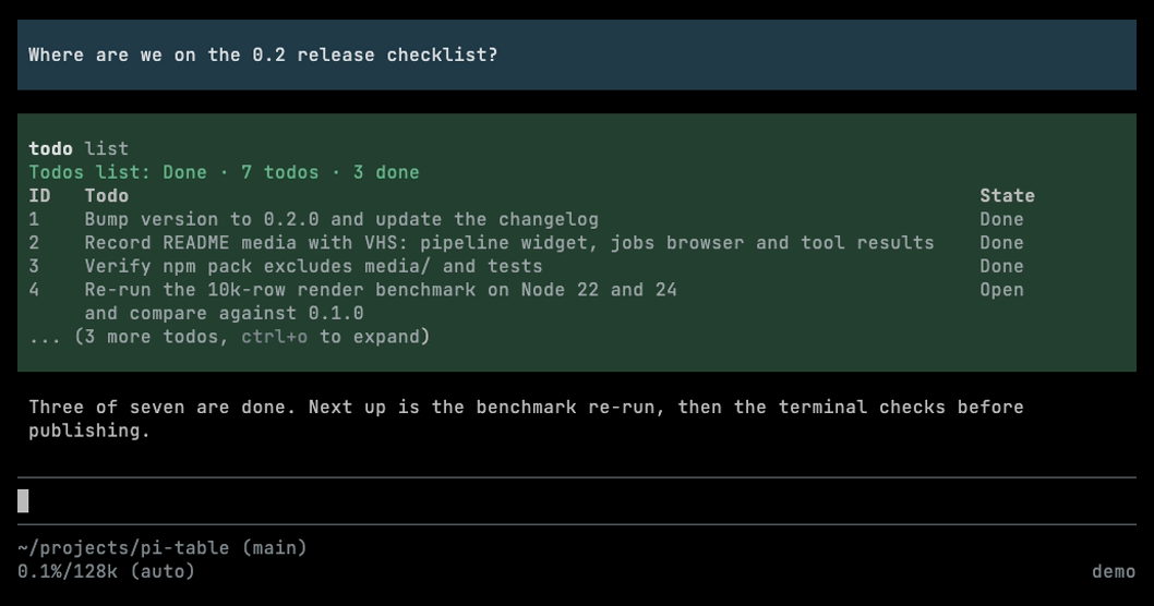
Collapsed and expanded tool-result table previews |
Both job examples share their columns, sample data and theme from examples/jobs.ts.
pi --extension ./examples/widget.ts --extension ./examples/custom-screen.ts
pi --no-extensions \
  --extension ./node_modules/@earendil-works/pi-coding-agent/examples/extensions/todo.ts \
  --extension ./examples/tool-result.ts
Widget
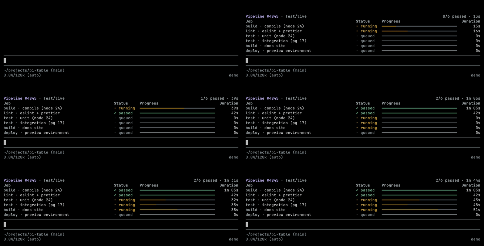
Save as widget.ts, load it with npx pi --extension ./widget.ts, and run /tasks.
import type { ExtensionAPI } from "@earendil-works/pi-coding-agent";
import { Table } from "@pmbaumgartner/pi-table";

export default function (pi: ExtensionAPI) {
  pi.registerCommand("tasks", {
    description: "Show task status",
    handler: async (_args, ctx) => {
      if (ctx.mode !== "tui") return;
      ctx.ui.setWidget("tasks", _tui => {
        const table = new Table({
          columns: [
            { id: "name", header: "Task", value: row => row.name, priority: 1 },
            { id: "seconds", header: "Time", value: row => row.seconds, align: "right" },
          ],
          rows: [{ name: "Build", seconds: 3 }],
          theme: {
            header: text => ctx.ui.theme.style(text, { bold: true }),
            border: text => ctx.ui.theme.fg("border", text),
          },
        });
        // In your data-update handler:
        // table.setRows([{ name: "Build", seconds: 4 }]);
        // _tui.requestRender();
        return {
          render: table.render,
          invalidate: table.invalidate,
        };
      });
    },
  });
}
- Remove the widget with
ctx.ui.setWidget("tasks", undefined). - After data changes, call a setter such as
setRows, thentui.requestRender(). Setters invalidate the table but never schedule a redraw. - Forward
invalidate()through any wrapper so host theme changes restyle the table. - Your extension owns fetching, timers and their cleanup; the table needs no disposal.
Picker
Save as picker.ts, load it with npx pi --extension ./picker.ts, and run
/pick-task. Pi's configured selection keys navigate, confirm and cancel.
import { getSelectListTheme, type ExtensionAPI } from "@earendil-works/pi-coding-agent";
import { SelectTable } from "@pmbaumgartner/pi-table";

type Task = { id: string; name: string };

export default function (pi: ExtensionAPI) {
  pi.registerCommand("pick-task", {
    description: "Choose a task",
    handler: async (_args, ctx) => {
      if (ctx.mode !== "tui") return;
      const chosen = await ctx.ui.custom<Task | undefined>(
        (tui, _theme, keys, done) => {
          const picker = new SelectTable<Task>({
            columns: [{ id: "name", header: "Task", value: row => row.name }],
            rows: [
              { id: "build", name: "Build" },
              { id: "test", name: "Tests" },
            ],
            getRowId: row => row.id,
            maxHeight: 7,
            theme: {
              header: text => ctx.ui.theme.style(text, { bold: true }),
              border: text => ctx.ui.theme.fg("border", text),
            },
            selectTheme: getSelectListTheme(),
            keybindings: keys,
            onSelect: row => done(row),
            onCancel: () => done(undefined),
          });
          return {
            capturesViewportInput: picker.capturesViewportInput,
            get focused() {
              return picker.focused;
            },
            set focused(value: boolean) {
              picker.focused = value;
            },
            handleMouse: picker.handleMouse,
            render: picker.render,
            handleInput: data => {
              picker.handleInput(data);
              tui.requestRender();
            },
            invalidate: picker.invalidate,
          };
        },
        { blocked: { kind: "question", message: "Choose a task" } },
      );
      if (chosen) ctx.ui.notify(`Chose ${chosen.name}`, "info");
    },
  });
}
When you wrap a SelectTable in your own component:
- Pass the
KeybindingsManagerthat Pi injects into thectx.ui.customfactory askeybindings, and build displayed hints from the same manager. pi-table may resolve its own pi-tui copy, whose global bindings do not include the user's configuration. - Forward
focused(getter and setter),capturesViewportInput,handleMouseandinvalidate. Themes that read the host theme at call time, includinggetSelectListTheme(), then follow host theme changes withoutsetTheme. - Call
tui.requestRender()afterhandleInput. ReturnhandleMouseresults unchanged; Pi reads their handled, focus and render flags. - Mouse input is fullscreen-only; never enable terminal mouse modes yourself. A screen
that draws other lines around the picker must translate events into the picker's
last-rendered rectangle and reject hits outside it, as
examples/custom-screen.tsdoes. - Pass
blocked: { kind: "question", message }to inlinectx.ui.custom()calls that await an answer, so supporting terminals report Pi as waiting. Overlays don't use this option.
render, measure and invalidate are bound to their instance on both components,
as are Table.getWindow and SelectTable.handleInput/handleMouse. Forward them
directly when the wrapper adds no behavior.
How it works
Responsive columns
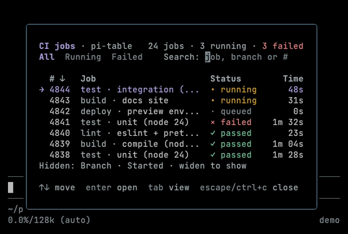
Columns are content-sized unless expand: true. On narrow screens the lowest-priority
columns hide first, and they return when space allows. The first highest-priority
column is never hidden; if it cannot fit, a too-narrow notice replaces the table.
The table adds no hidden-column notice of its own. Build one from
measure(width).hiddenColumns, and set label when a short header such as "P"
needs a readable name such as "Priority".
Use shrink: false for identity columns such as IDs and filenames. Their natural
width becomes their minimum, so other columns shrink and hide first. Priority still
applies to them.
Windows and bounded previews
window: { offset, maxHeight } shows only the whole rows that fit in maxHeight lines,
counting the header and borders. Columns are still sized from every row, so pass the
full dataset rather than pre-slicing rows or lines. getWindow(width) reports what
fit as half-open row bounds, which is enough for a "more" footer:
table.setWindow(expanded ? undefined : { offset: 0, maxHeight: 6 });
// Inside render(width):
const lines = table.render(width);
const { end, total } = table.getWindow(width);
if (end < total) lines.push(truncateToWidth(`... ${total - end} more`, width));
A wrapped row that does not fit is omitted entirely, so read getWindow at the
render width every time. Its status is "ready", "too-narrow" or "blank"
(zero width or no columns). To scroll, use start as the next offset.
examples/tool-result.ts applies this to a collapsible tool-result renderer:
Picker height and selection
SelectTable renders single-line, ellipsized rows behind a two-cell selection gutter,
so table content is two cells narrower than the render width. Height is set by:
maxHeight, the line budget for the whole picker: headers, borders, data rows or the empty message, and the position line shown when rows overflow.maxVisible, a cap on data rows. Supply either or both; the line budget wins.fill: true, which pads to exactlymaxHeightso centred overlays stay put while filtering.showPosition: false, which omits the position line when your screen shows it elsewhere.
When the budget cannot fit one row plus chrome, render() returns []. Selection
input pauses, cancel still works, and the selection is kept for when space returns.
Selection follows getRowId through setRows reordering and setFilter. When the
selected row disappears, onRemoved: "neighbor" (the default) selects the row at
the old position, while "clear" leaves nothing selected until select(id) or
navigation.
Confirmation only accepts rows the user has seen. Keyboard confirm fires onSelect
only if the selected row, matched by ID and object, appeared in the latest successful
render; a mouse click confirms the visible row it pressed. Replace row objects
rather than mutating them, since in-place changes are not detected.
Styling
Style through theme callbacks, not pre-coloured data. Callbacks run after layout and must be pure, synchronous SGR styling: preserve the supplied text and width, close their own attributes, avoid full resets when inheriting a background, and emit no cursor or OSC sequences. Terminal controls in cell data are stripped before styling.
Read the host theme at call time, so a theme change only needs invalidate():
import type { Theme } from "@earendil-works/pi-coding-agent";
import type { TableTheme } from "@pmbaumgartner/pi-table";

type Task = { name: string; status: string };

export function taskTheme(current: () => Theme): TableTheme<Task> {
  return {
    header: text => current().style(text, { bold: true }),
    cell: (text, { row, columnId, selected, focused }) => {
      if (selected && focused) return current().fg("accent", text);
      if (columnId !== "status") return text;
      if (row.status === "Done") return current().fg("success", text);
      if (row.status === "Running") return current().style(text, { bold: true });
      return current().fg("muted", text);
    },
    emptyText: text => current().fg("muted", text),
    border: text => current().fg("border", text),
  };
}
// Pass theme: taskTheme(() => ctx.ui.theme) when constructing your table.
SelectTable adds selected (kept while unfocused) and focused to the cell context.
Use them to mark the selected row when cell colours would override selectedText.
Keep labels readable without colour.
Spans
A cell accessor can return a readonly CellSpan[] of { text, token? } instead of a
scalar. Layout treats the spans as one plain string, never splitting graphemes, then
calls theme.span(text, token, context) for each run of output. Unstyled text,
padding and ellipsis arrive with token === undefined. For these cells span
replaces cell; without span, they fall back to cell. Tokens are your own
names, not colours. examples/jobs.ts uses them for muted stage prefixes, status
colours, progress bars and search matches.
matchSpans builds spans for literal search highlighting, case-insensitive by default:
import { matchSpans } from "@pmbaumgartner/pi-table";

matchSpans("Build build", "BUILD");
// [{ text: "Build", token: "match" }, { text: " " }, { text: "build", token: "match" }]
Filtering and the matching policy belong to your screen, and sorting uses comparators over semantic fields, not span arrays. When the query changes, recompute spans, invalidate and request a redraw.
API
new Table<Row>(options)
Cells accept strings, numbers, booleans, null or undefined (shown empty) and
CellSpan[]. Text wraps by default. Each column (TableColumn<Row>) needs a unique
id, a header and a pure synchronous value(row) accessor.
| Column option | Default | Meaning |
|---|---|---|
width |
Fixed content width in cells; replaces automatic sizing | |
minWidth, maxWidth |
1, 10000 |
Automatic sizing bounds |
grow |
1 |
Share of surplus width when expand is on; 0 opts out |
shrink |
true |
false keeps natural width as the minimum |
align |
"left" |
Or "center", "right" |
overflow |
"wrap" |
Or "ellipsis" |
priority |
0 |
Lower hides first on narrow screens |
label |
header |
Name for hidden-column notices and accessibility |
compare(a, b) |
Comparator for sortRows |
| Table option | Default | Meaning |
|---|---|---|
border |
"none" |
Or "square", "rounded", "ascii" |
showHeader |
true |
|
showRowSeparators |
false |
Rules between rows |
padding |
1 |
Gap between unbordered columns; per-side padding with borders |
expand |
false |
Fill the available width |
emptyText |
"No rows" |
"" hides the message |
theme |
header, border, cell, span and emptyText callbacks |
|
window |
{ offset, maxHeight, keepVisible? } |
Methods:
render(width)renders at an integer width from 0 to 10,000.measure(width)andgetWindow(width)query layout without calling styling callbacks.setRows,setColumns,setThemeandsetWindow(window | undefined)update one setting.replaceOptions(options)replaces the whole configuration, resetting omitted options.invalidate()clears caches after external mutations or theme changes. It does not redraw.
Invalid sizes throw RangeError; the type docs give exact limits.
new SelectTable<Row>(options)
Takes Table options except window and showRowSeparators, plus:
| Option | Meaning |
|---|---|
getRowId(row) |
Required: unique, nonempty string ID |
selectTheme |
Required: pi-tui SelectListTheme, e.g. getSelectListTheme() |
keybindings |
Required: the KeybindingsManager from ctx.ui.custom |
maxHeight, maxVisible |
At least one is required |
fill, showPosition |
Default false and true |
onRemoved |
"neighbor" (default) or "clear" |
onSelect, onCancel, onSelectionChange |
Optional callbacks, also assignable as properties |
emptyText defaults to "No matching rows". Methods:
- Data:
setRows(rows),setFilter(predicate | undefined),setColumns(columns). - Selection:
getSelected(),select(id),moveBy(delta, { wrap })(wraps by default),pageUp(),pageDown()andgetPosition(), which returns a one-based{ position, total }. These work while unfocused, andonSelectionChangefires only when the selection changes. - Sizing and presentation:
setMaxHeight(lines),setMaxVisible(count),setTheme(tableTheme, selectTheme?)andupdatePresentation(settings), which mergesemptyText,padding,border,showHeaderandexpand;undefinedrestores a default. - Hints:
getNavigationState()returnscanMoveUp,canMoveDown,canPageUp,canPageDown,canConfirmandhasMoreRows. Read it after rendering. - Component:
render,measure,handleInput,handleMouse,invalidate,focusedandcapturesViewportInput.
Helpers and types
sortRows(rows, columns, { columnId, direction })returns a stable sorted copy using the column'scompare, with direction"ascending"or"descending". Tables never sort automatically; pass the result tosetRows.matchSpans(text, query, { token, caseSensitive })defaults to token"match"and case-insensitive matching.
All option, theme, measurement and window types are exported, including TableColumn,
TableOptions, TableTheme, CellSpan, CellValue, SelectTableOptions and
SelectTableNavigationState.
Development
npm ci
npm run check       # format, lint, typecheck and tests
npm pack --dry-run  # inspect the package contents
npm run media       # regenerate media/ screenshots; needs `brew install vhs`
The media/*.tape scripts run Pi through media/pi.sh with a throwaway, offline
agent directory seeded from media/pi-agent/, so they never use your credentials,
settings or sessions. The tool-result shot replays a recorded session instead of
calling a model.